
Improving Instagram Video Experience.
Overview
Objective - Improve the video experience for users in Instagram.
Category: Personal Project
Duration: 2 Days
Type: UI/UX, Conceptualization
Story:
Instagram is one of the fastest growing and used mobile application in the world. It is estimated to have 1.074 billion users worldwide in 2021. This is a big milestone for a social app especially because this 73.5 million more users than it had in 2020.
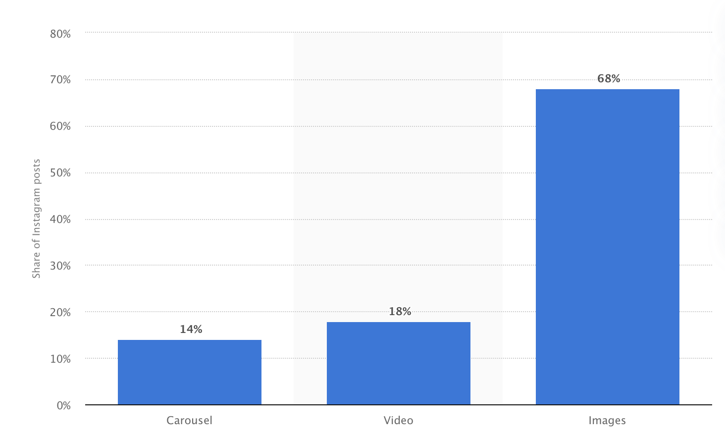
95 million photos and videos are shared on Instagram per day. And according to Statista, 18% of those posts are videos. Which translates to over 17 million video content posted per day.
As a fervent instagram user myself, I face a frustrating issue every day whenever I go through the video content. In order to ensure that I am not the only one facing this issue, I asked 20 other instagram users, aka my friends, these questions.
Do you wish that you can rewind and fast forward video content in Instagram.
Have you ever felt impatient while watching Instagram videos?
Thankfully my friends agreed with me as 18 of them said yes to both of these questions.
Current Problem / Instagram Video Platform
Instagram currently has four platforms in the app that supports videos. These are reels, video posts, IGTV and stories. Stories are hard to pinpoint because they can only be 15 seconds long. Reels are slightly longer as they can be 30 second long. Video posts can be a minute long and IGTV can be up to 10 minutes for normal accounts.
But the problem is that most users are increasingly impatient to watch the whole thing.
The average attention span for a goldfish is 9 seconds, but according to a new study from Microsoft Corp., people now generally lose concentration after eight seconds, highlighting the affects of an increasingly digitalized lifestyle on the brain.
Based on these studies and articles BBC World Service , Time , Adage, and Talking Tree Creative, Millennials are more effective in shifting through unnecessary information. They want to just get to the point.
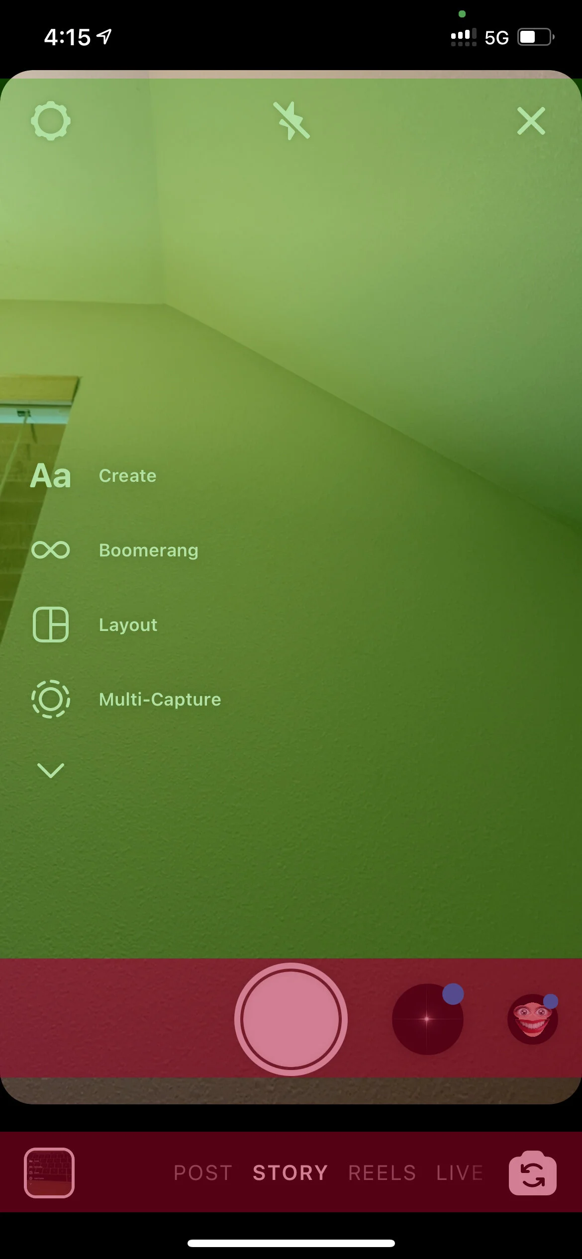
Instagram don’t necessarily make this any easier because video posts or reels don’t have any sort of control besides the option to mute or unmute. Video posts can be up to 60 seconds long and can be very frustrating for the user if they watch the whole video to only be left—unentertained.
The most cool thing about Instagram is that everything is pretty much seamless in navigation. Rather than clicking through navigation, the user can simply use some finger gestures to navigate throughout the whole app. This makes for a good efficient user flow without any “pause”. In any other video content platform such as Youtube/Netflix/Crunchyroll, there a bunch of controls which may be due to the fact that those platforms are made for more “longer” content. Instagram is more for “shorter” length content.
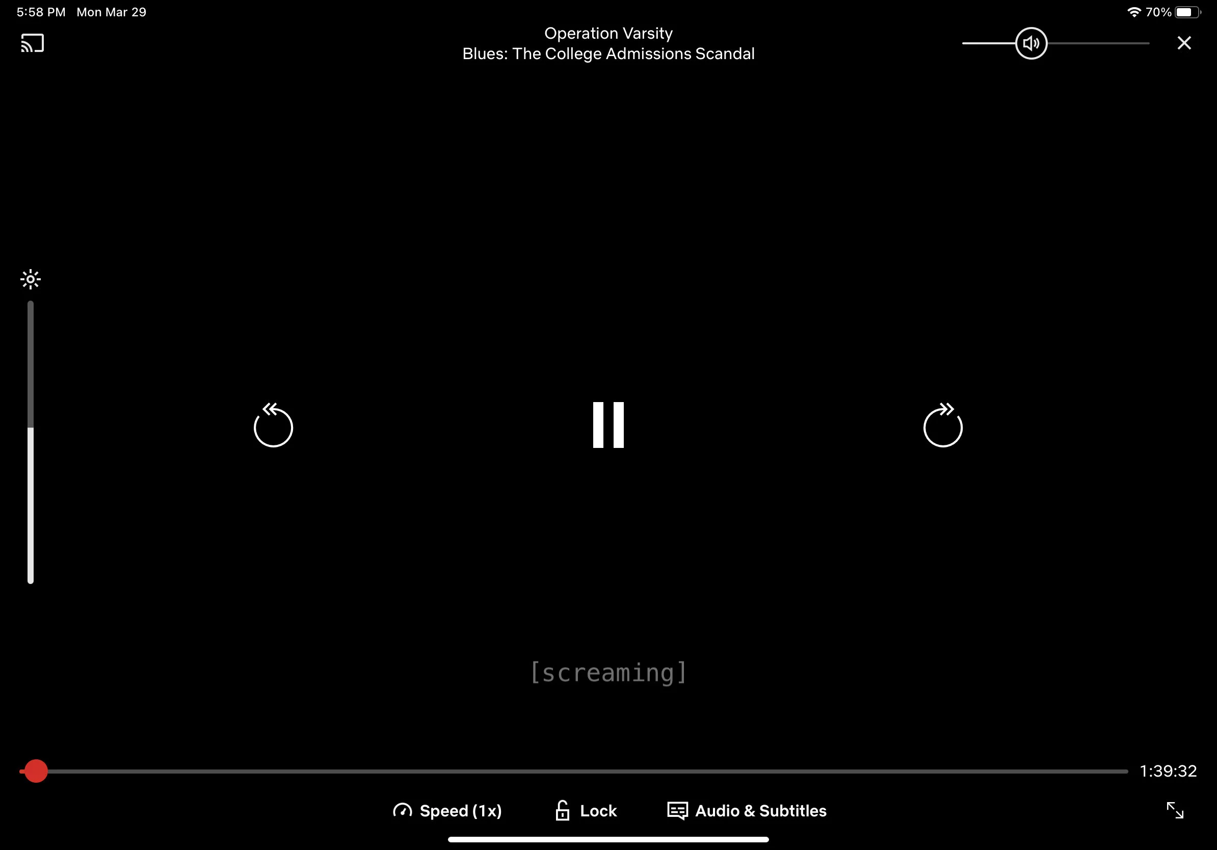
Netflix App Player
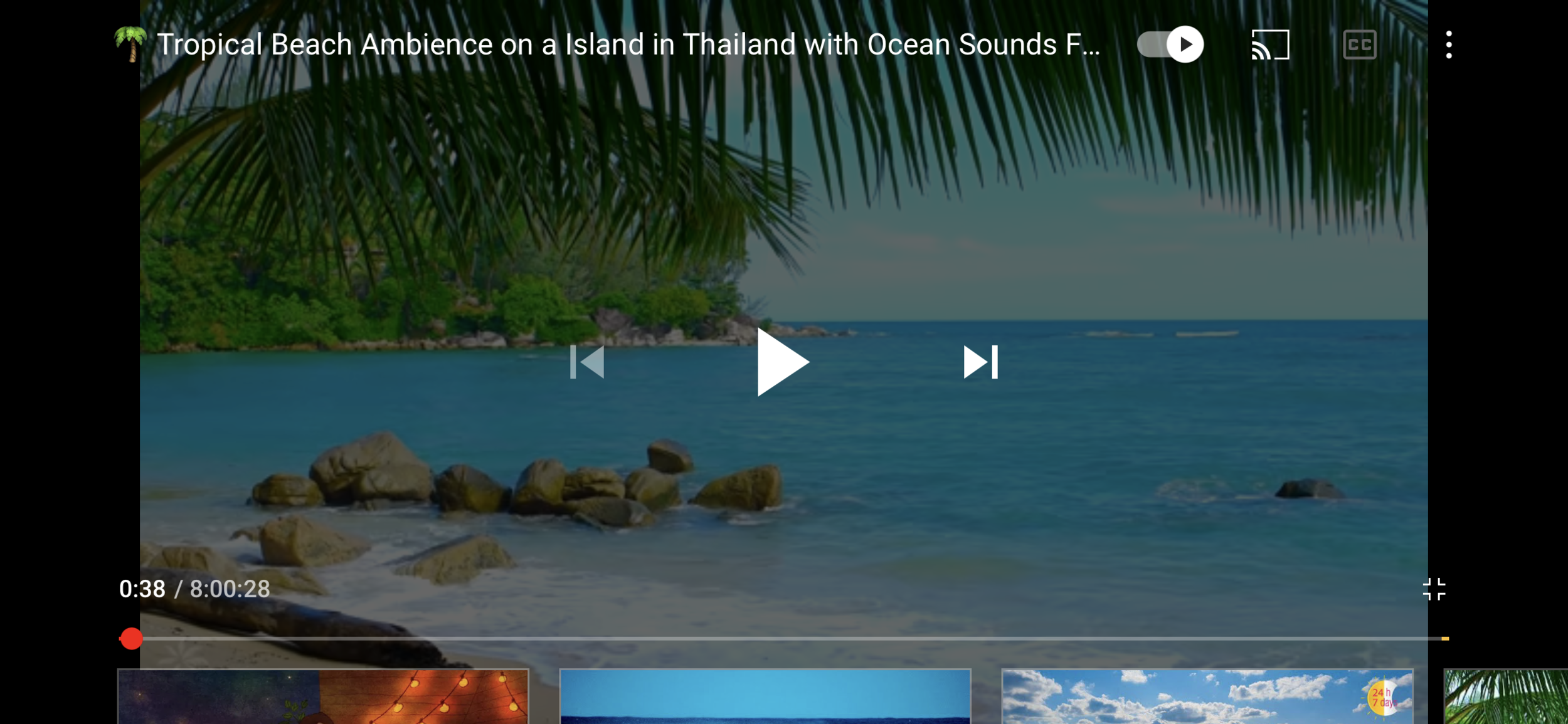
Youtube App player
Challenge
I want to improve the video experience where I can solve the main issue has to be something simpler and smaller. My main challenge was to design elegant solution that will not only solve the main problem but also will fit the entire flow of an app and will be as natural as current solutions, which are familiar for Instagram users.
Here are some navigation features I found while reviewing this mobile application
Home Feed:
Swipe right that’s not on post: Goes to messages
Swipe left that's not on post: Goes to camera
Swipe down: Goes throughout the home feed
Swipe up: Refreshes the feed
Camera page:
Swipe up: Shows phone gallery
Swipe right: Goes back to home
Swipe left: nothing
Swipe up: nothing
IGTV Full Screen
Swipe right: Next Video
Swipe left: Previous Video
Swipe up: See upcoming videos
Swipe down: nothing
Doubletap on right side/left side: fastforward 10 sec.

IGTV Control Screen
Same as full screen but does not apply to the control panel.
Ideation
I thought a easy solution to this would probably be using gestures. This seem to be the most reasonable and automatic solution as most users use the “slide” gesture in the timeline panel in most video platforms such as Youtube. But this could contradict the current navigation system (as noted in the diagram above) by moving the user to their messages or camera.
My second thought was possibly adding a hold-slide gesture as if the whole post was a timeline? Still, I thought this may be confusing to users and may result the same mistakes as noted above.
So I thought to myself. What if I propose that if a user press and hold to the left of the screen (of the post ) and the video would automatically start rewinding as long as you kept it pressed? And what if the user pressed and hold to the right side of the screen it would fast forward as long as you keep it pressed? This might help avoid situations where the user would mistakenly—swipe to the camera or messages screen.
Long press will be important in this situation because I wanted to be sure there will be no instance where the user would trigger video control by mistake while jumping to a different screen just by swiping.
I roughly made a mockup/prototype as you can see on the left.
Final Thoughts
Content in 2021 and beyond is the source of infinite plethora to many– ranging from large corporations to individual creators. With the sharp increase in the size of our social feeds, users are growing to be increasingly impatient and want content as quick and direct as possible. User needs and attentions will need to be grabbed upon within seconds.
In the Future
I predict that more platforms will develop adaptive designs that can react to different attention needs of the users.