Objective
When I was a freshman in college, I worked a retail job that had me commute to work at 6am. Being new to NYC, it was scary to walk alone in the pitch dark. I did not feel safe and had to call a friend during the commute because I was scared. It helped a little but I knew calling a friend would not *technically* keep me safe.
thus…I didn’t really feel safe at all.
Challenge: How to make one FEEL safe and be protected at the same time.
Overview
Objective - Create a App for users to feel and be safe when they are walking alone.
Category: Personal Project
Type: UI/UX, Conceptualization
Tools: Adobe XD
My role - Since this is a solo project, I will be performing all project roles, from research to develop of the Hi-Fi prototype.
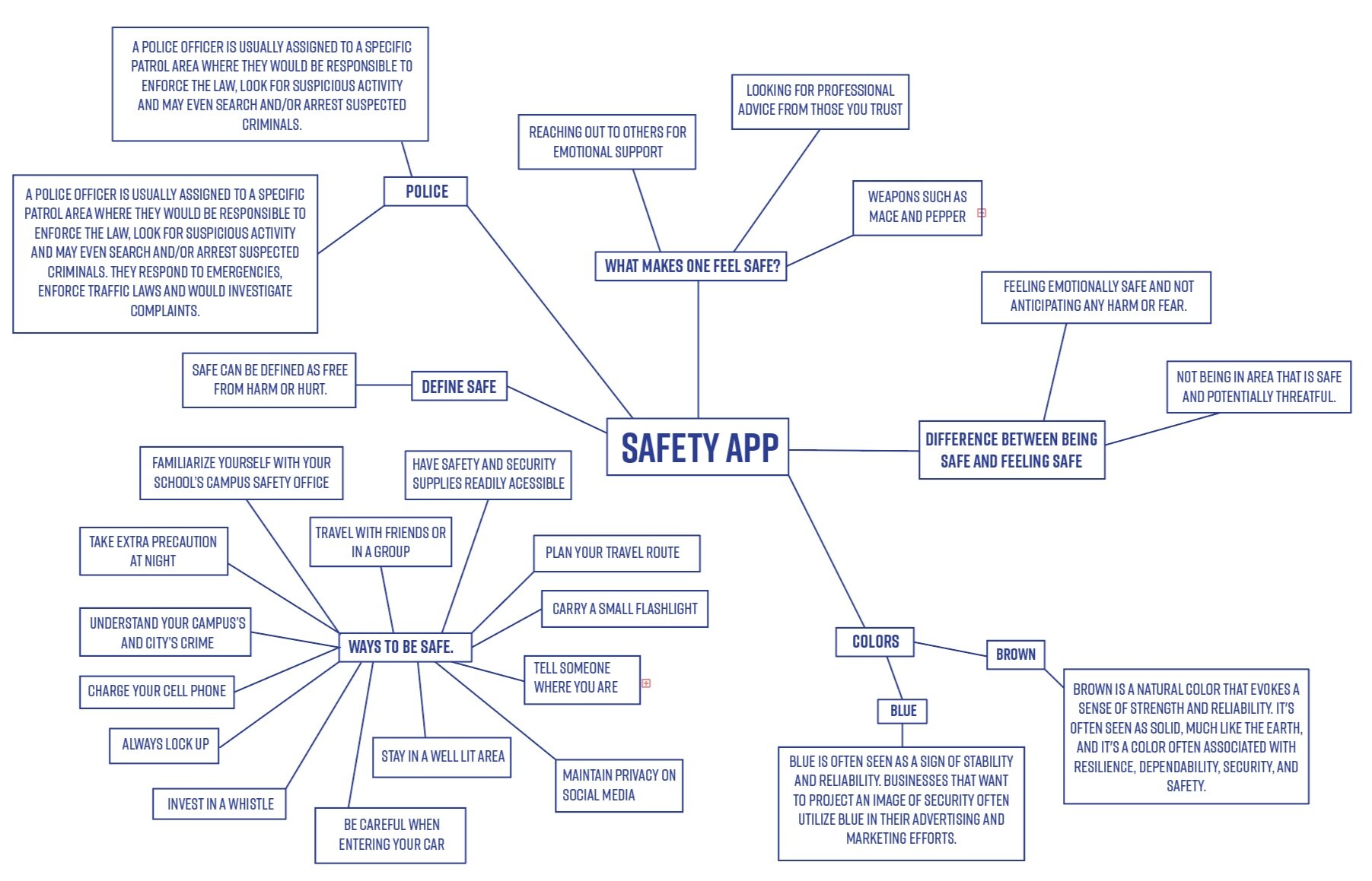
Mindmap
To help me get started and have a better understanding of “feeling and being safe”— I first researched the keywords that composes this app.
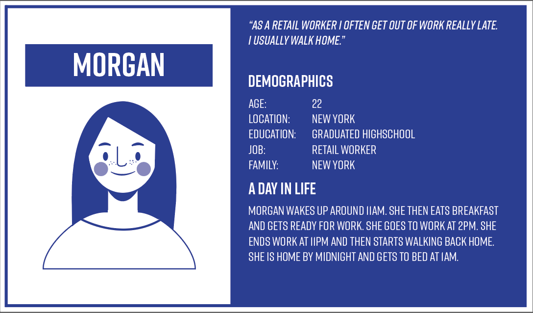
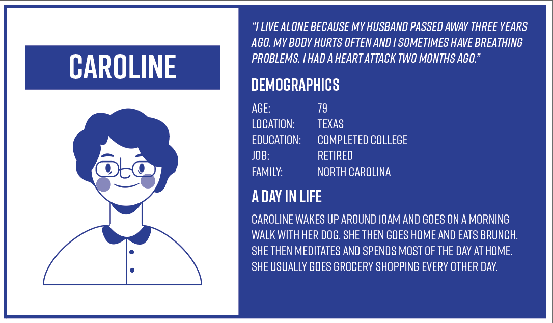
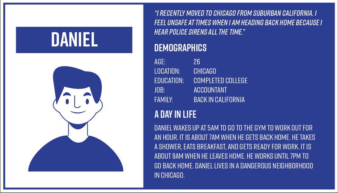
Personas
In order to illustrate the key audience of my product, and to help potential stakeholders gain more sympathy for the target issues, I decided to build personas. After asking multiple coworkers, friends and relatives, I listed the insights out and developed 4 personas according to my personal experience and to others.

Competitive Analysis (Out of 5 stars)
I looked up applications that similar
Sekura :
About: Sekura is a safety app targeted for women.
★★★★ Efficiency of Use: Sekura Home Screen gets straight to the point and has four clear objectives. The purple button is to send your location to one of your contacts, green is to make siren noises, yellow is to mark the street as “dark”, and the red is to emergency contact. Very simple and clear.
★★Safety: Sekura is Sekura offers siren noises, notes to mark street as dark, emergency contact , and send location to a contact. I believe Sekura lacks in the space of safety because emergency contact is something that we can do without the app. Also, even if we were able to contact emergency, we might not be in a position to be able to speak on the phone. So I found this area to be lacking.
★★★★★ Onboarding: Most apps required a multiple step process but this app was pretty much ready to go.
Overall: App lacks a lot of features that other apps have.
Noonlight:
About: Noonlight’s mission is to protect and comfort the user so they can live freely.
★★★ Efficiency of Use: Moonlight at first impression, is a bit confusing. Although it does not have any crowded scenes, it has a lack of information.
★★★Safety: Noonlight offers journal recordings that are sent to the police once the alarm is released. It also sends the police station your location. However there is no other special features.
★★★★ Onboarding: Noonlight’s onboarding system is not too difficult and just requires basic information.
Overall: App has a one strong feature, which is sending the emergency station, your location.
Safetipin
About: Safetipin is a personal safety app that help you take safer decisions, based on the safety score of an area.
★★Efficiency of Use: Safetipin’s UI was the most confusing out of the three. There was a lack of instruction and nothing was super clear.
★Safety: Safetipin is more of a app for precaution as it just displays the streets that are seen “unsafe” by other users. This can also open the possibility of legitimacy of wrong information.
★Onboarding: Safetipin had the most tedious sign up information and required a user to have an account. It is not a ideal app for users who are quickly looking for safety.
Overall: Safetipin does not have accurate resources to the user and does not provide safety in anyway besides providing minimal safer decisions.
***My findings motivated me to:
Research which features were successful and that most users use.
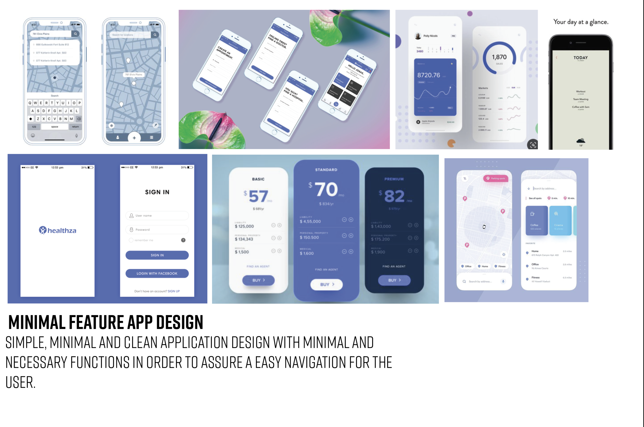
Create a user friendly interface that’s minimal and clean.
Incoporate visuals that make the user feel calm and safe but also a sense of “alertness”
Provide a easy onboarding service to the user.
Conduct user testing in the future prototypes for live feedback.
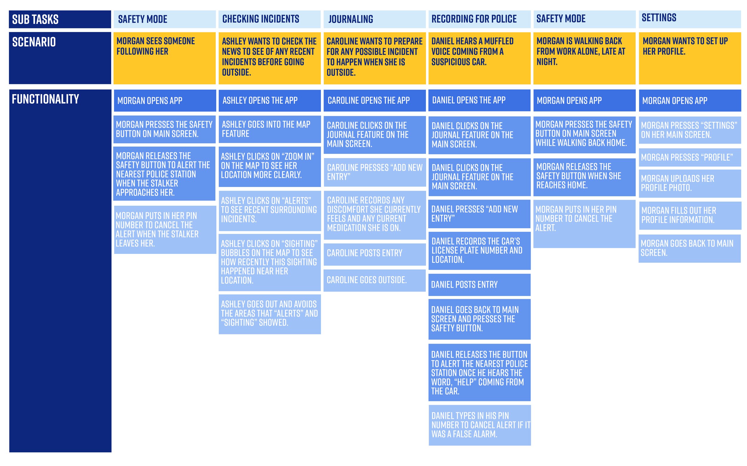
Task Analysis
I created a chart to brainstorm list all the possible tasks to understand in detail how users perform their tasks and achieve their intended goals (to be safe). These tasks analysis will help me identify the tasks that my app must support. Afterwards I select the solutions which are more possible to be fit into a real life user scenario.
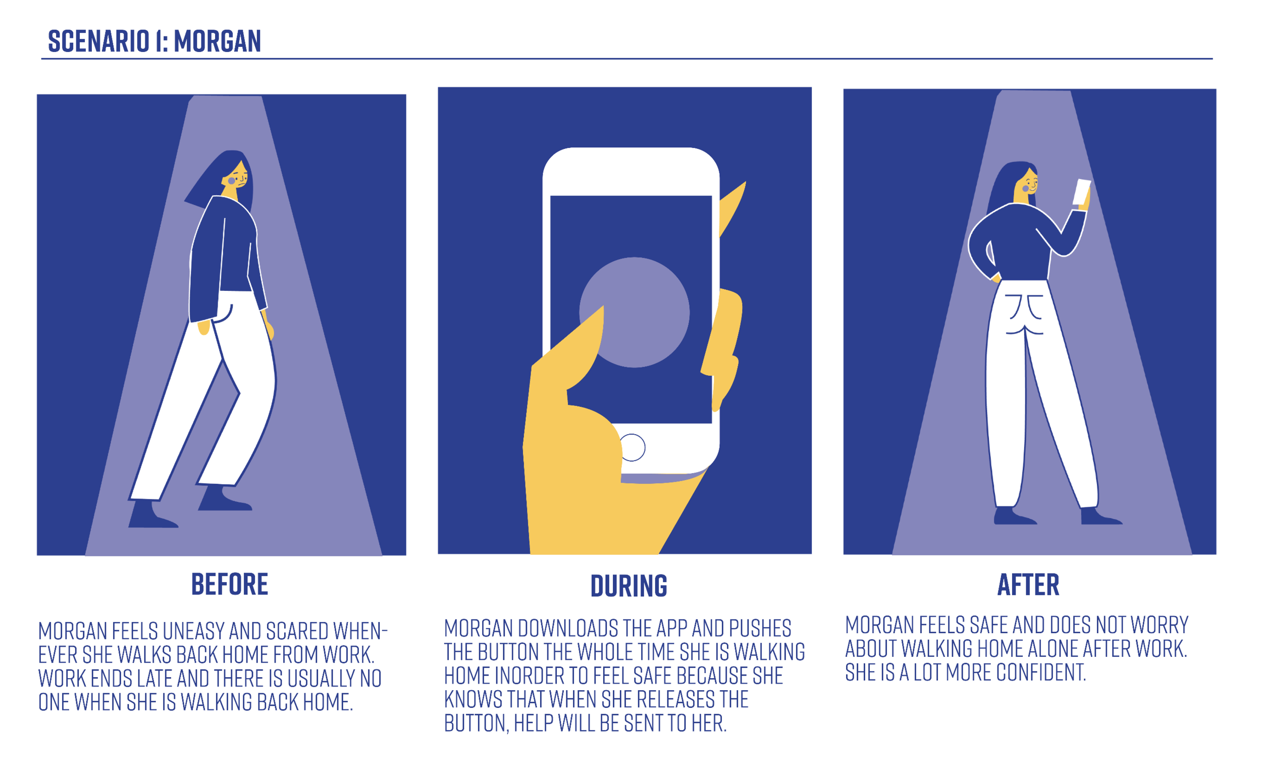
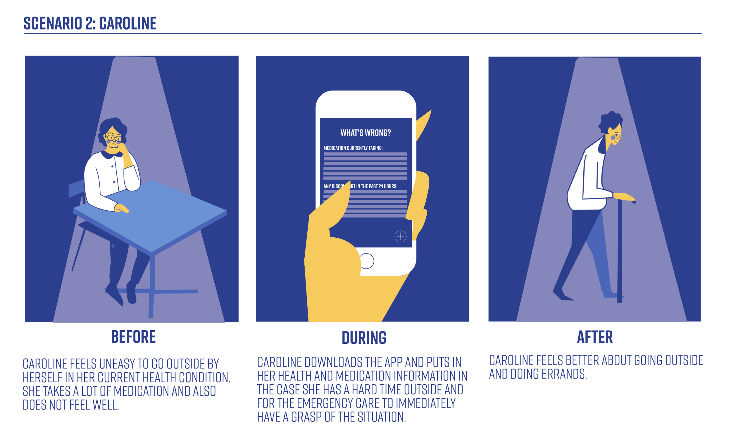
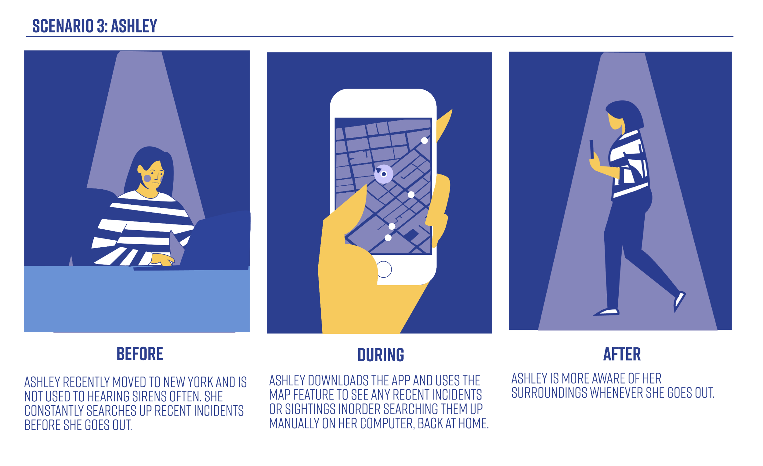
Scenarios
I then created 3 scenarios based off of my brainstorming to describe the stories and context behind why a specific user or user group will use my application. These 3 scenarios will help note the goals and questions to be achieved and possibly define the possibilities of how these problems. can be solved.
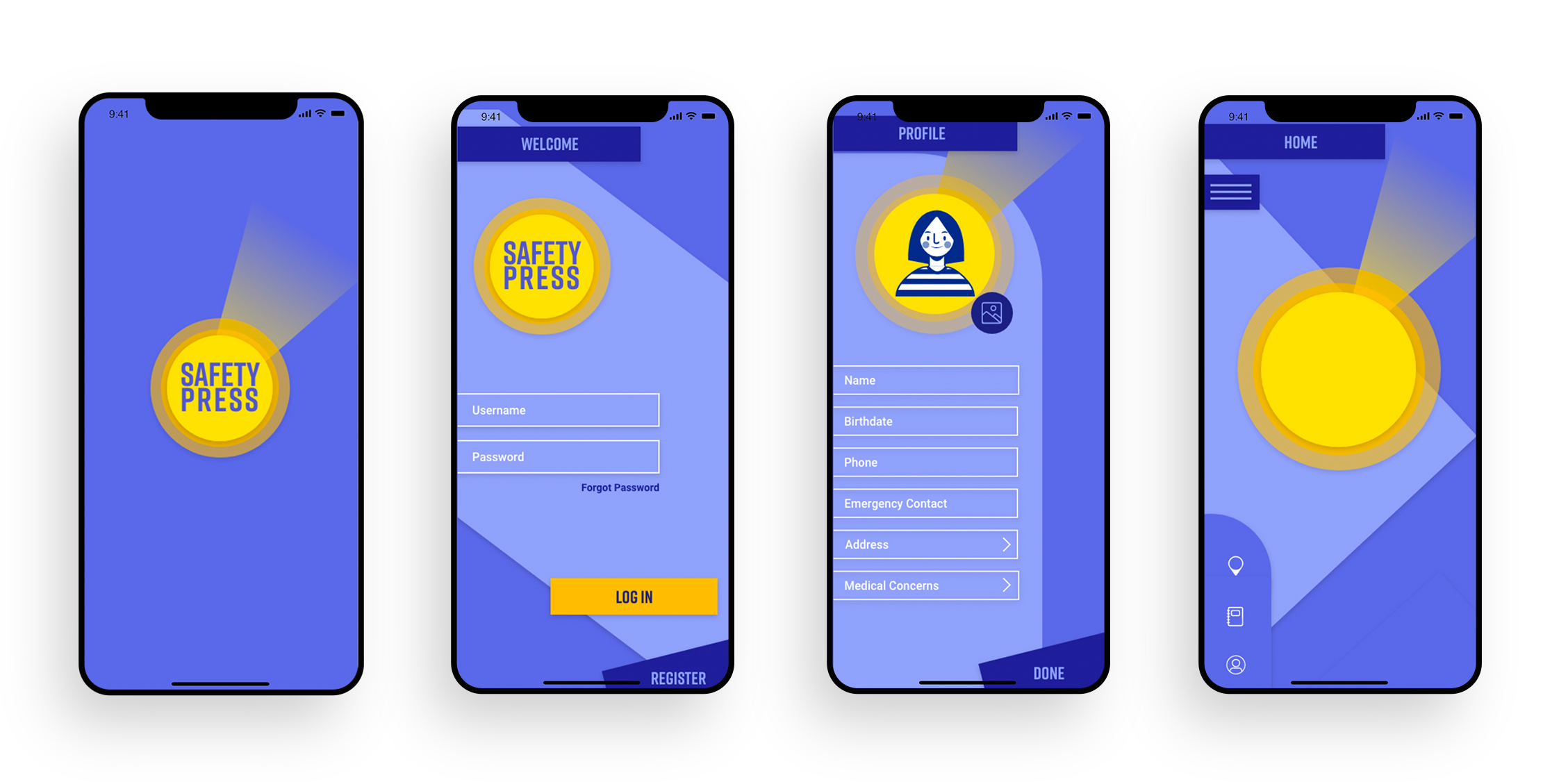
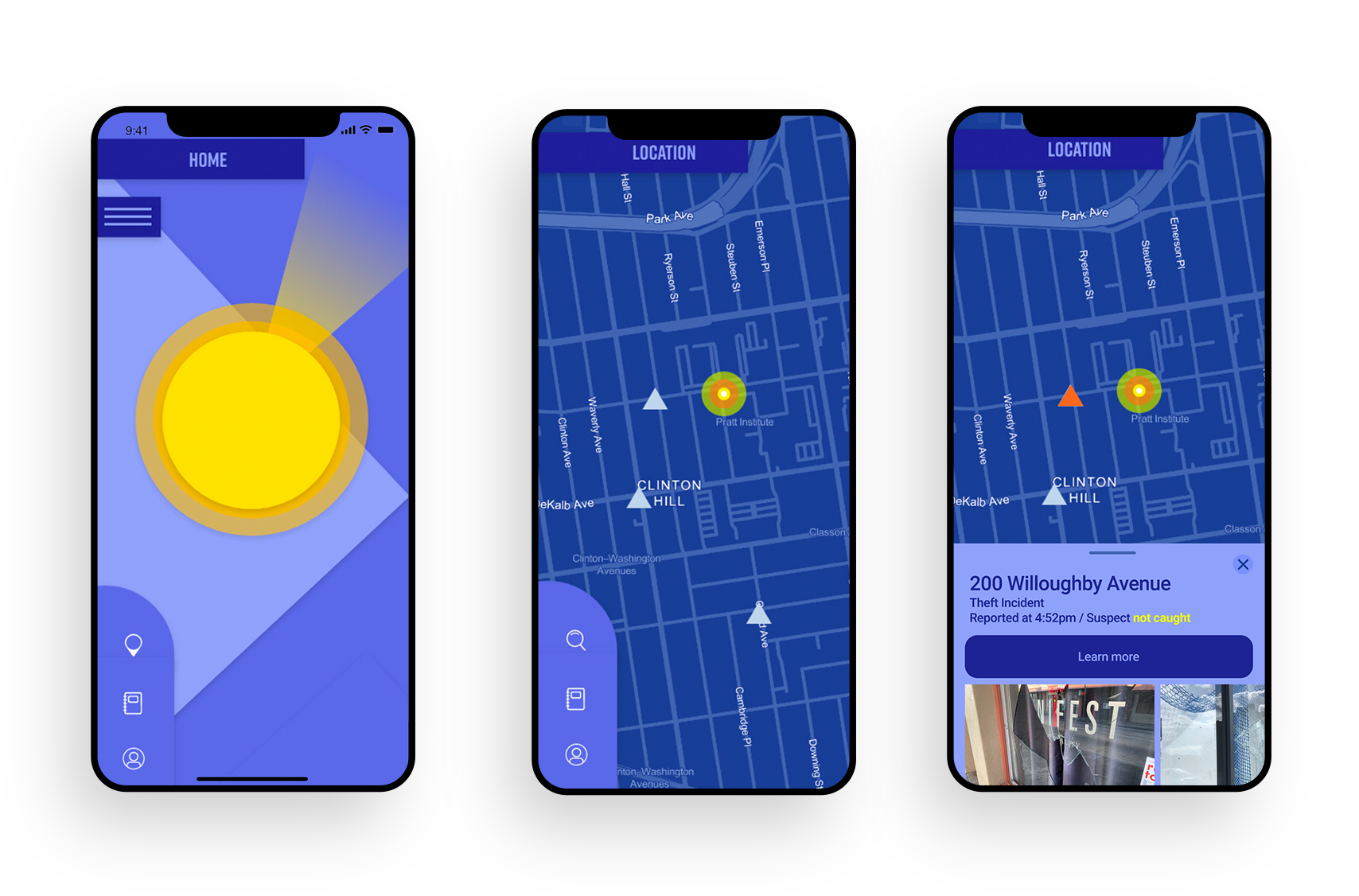
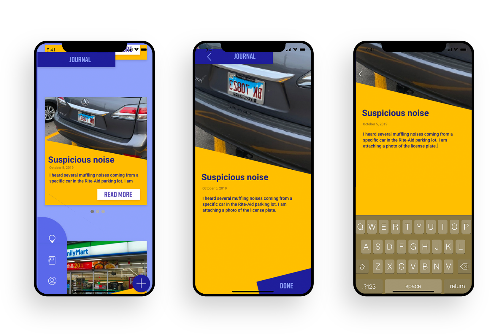
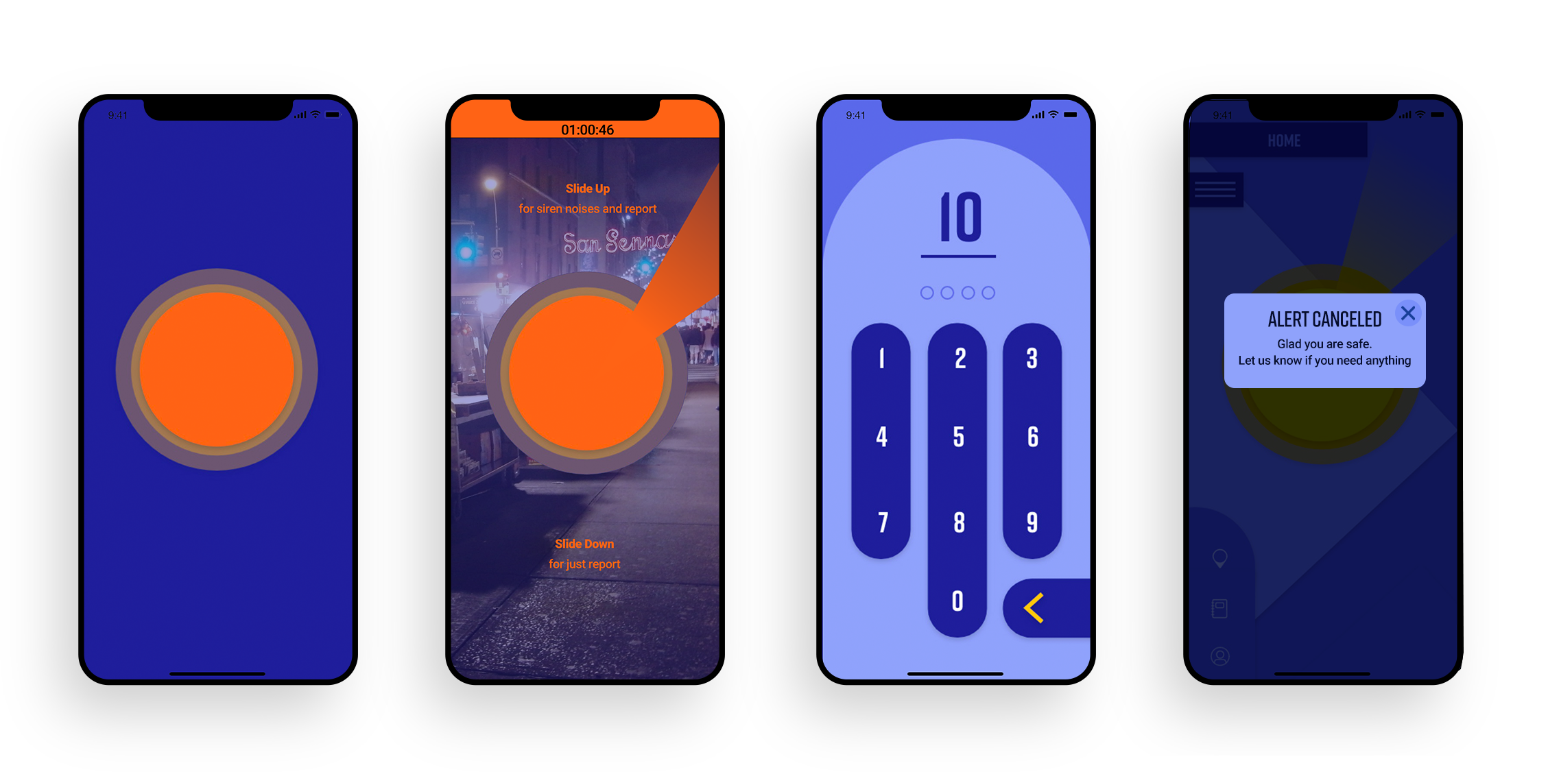
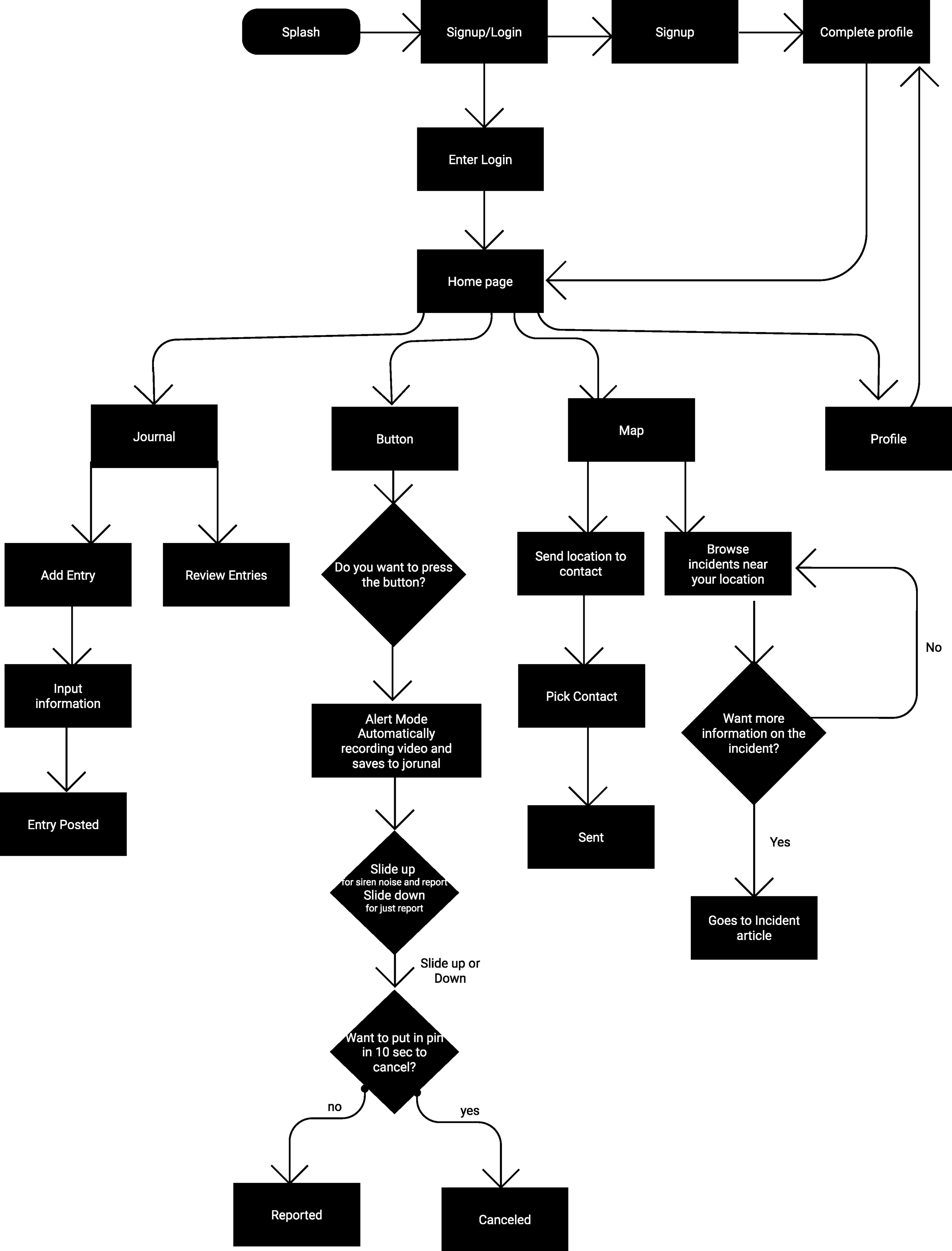
Site Map
After looking at my task analysis, I was able to find the core functionalities that helped me create a user flow. After defining the core functionalities I was able to create a user flow.
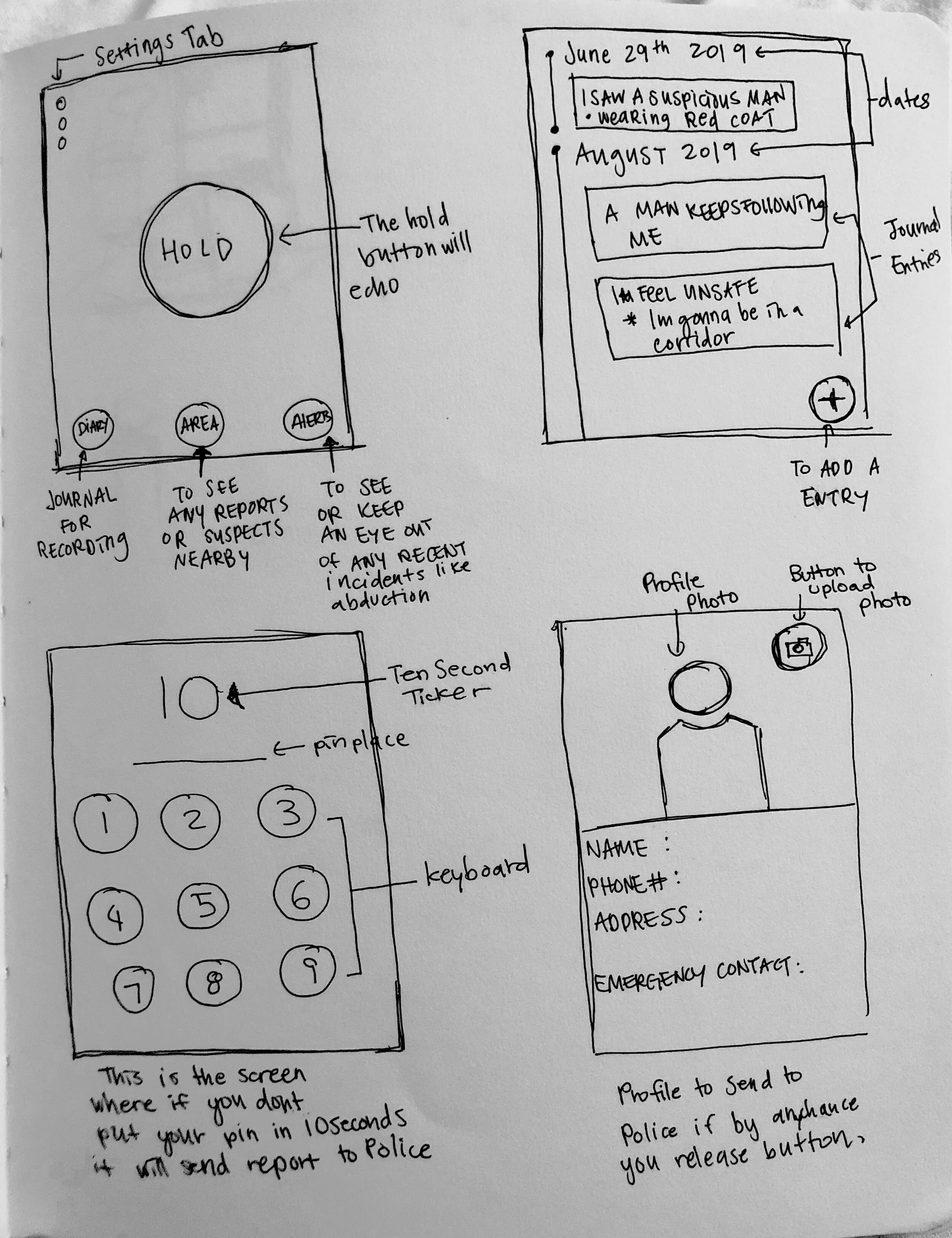
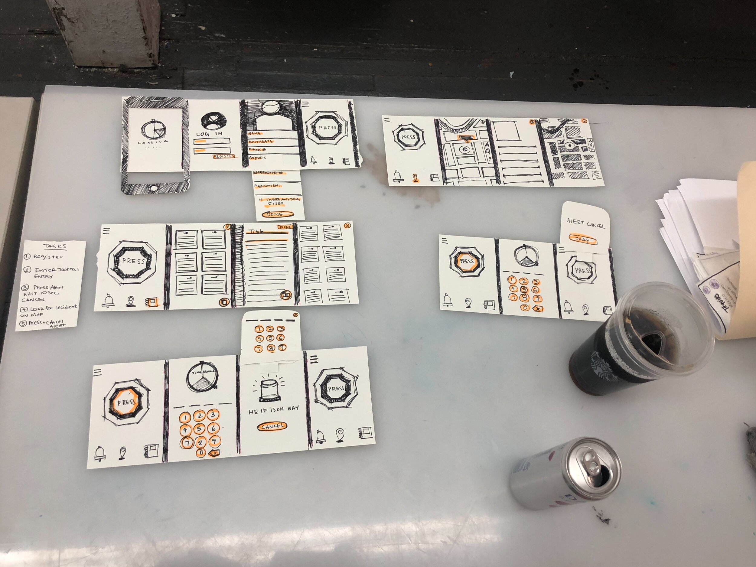
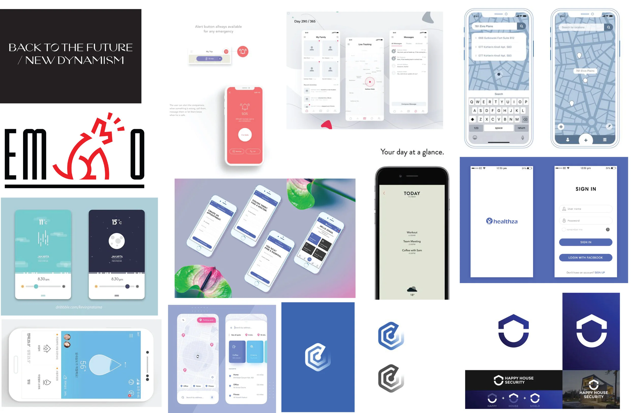
Sketches
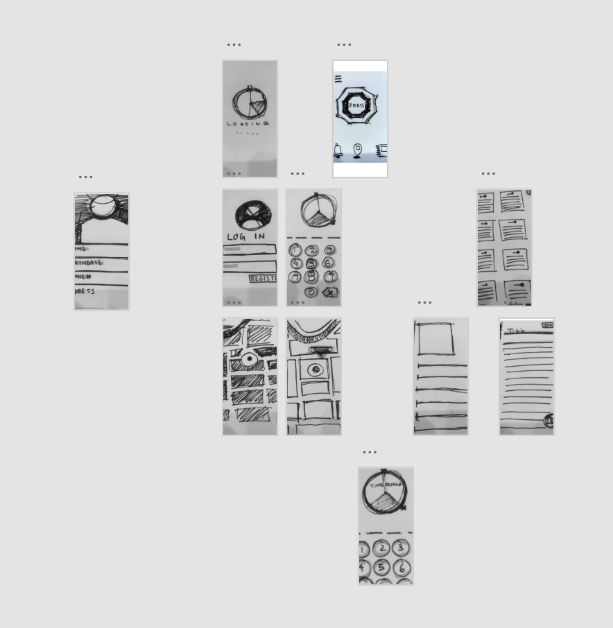
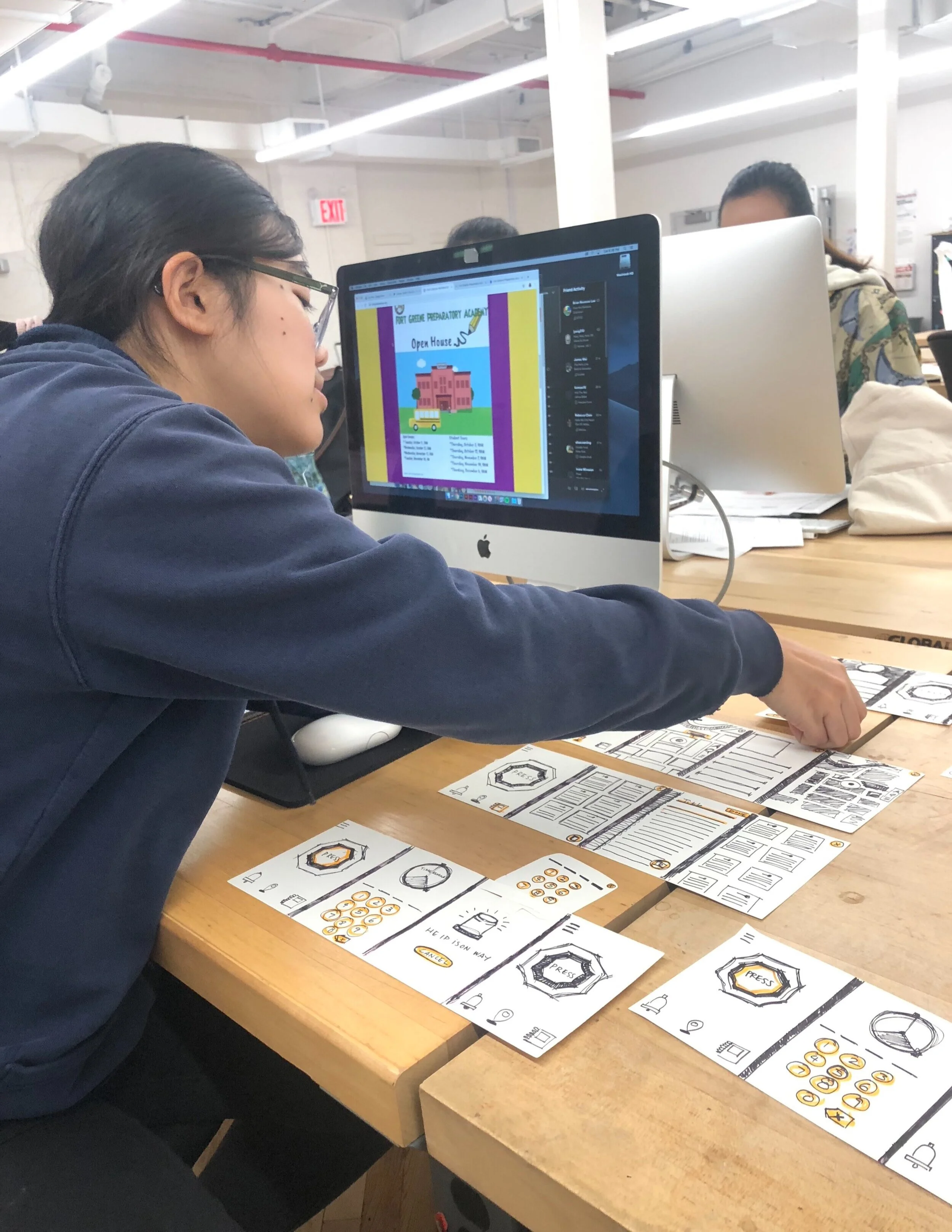
Paper Prototype and User Testing
I made a paper prototype of my wireframes so I can ask my peers to test out. I asked 4 peers to go through my paper prototype.
Some changes I noticed to make that motivated me to make changes for my next round.
Notes are difficult to see because there is too many in one screen
Don’t know how to write in the journal.
There was some lack of clarity between a button that was pressed and not.
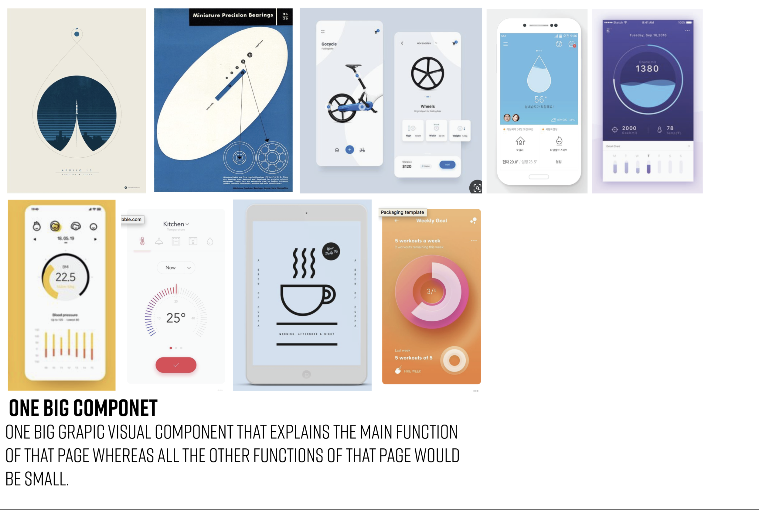
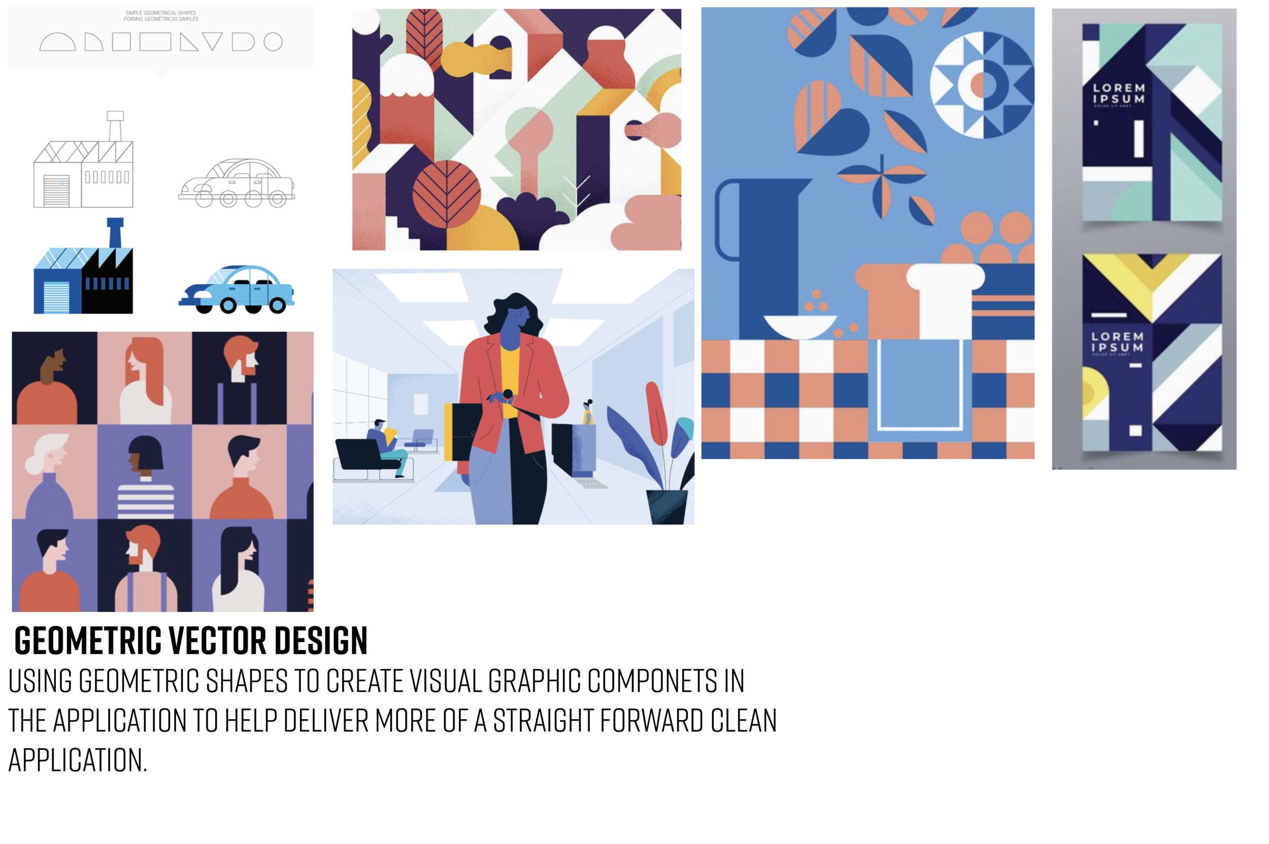
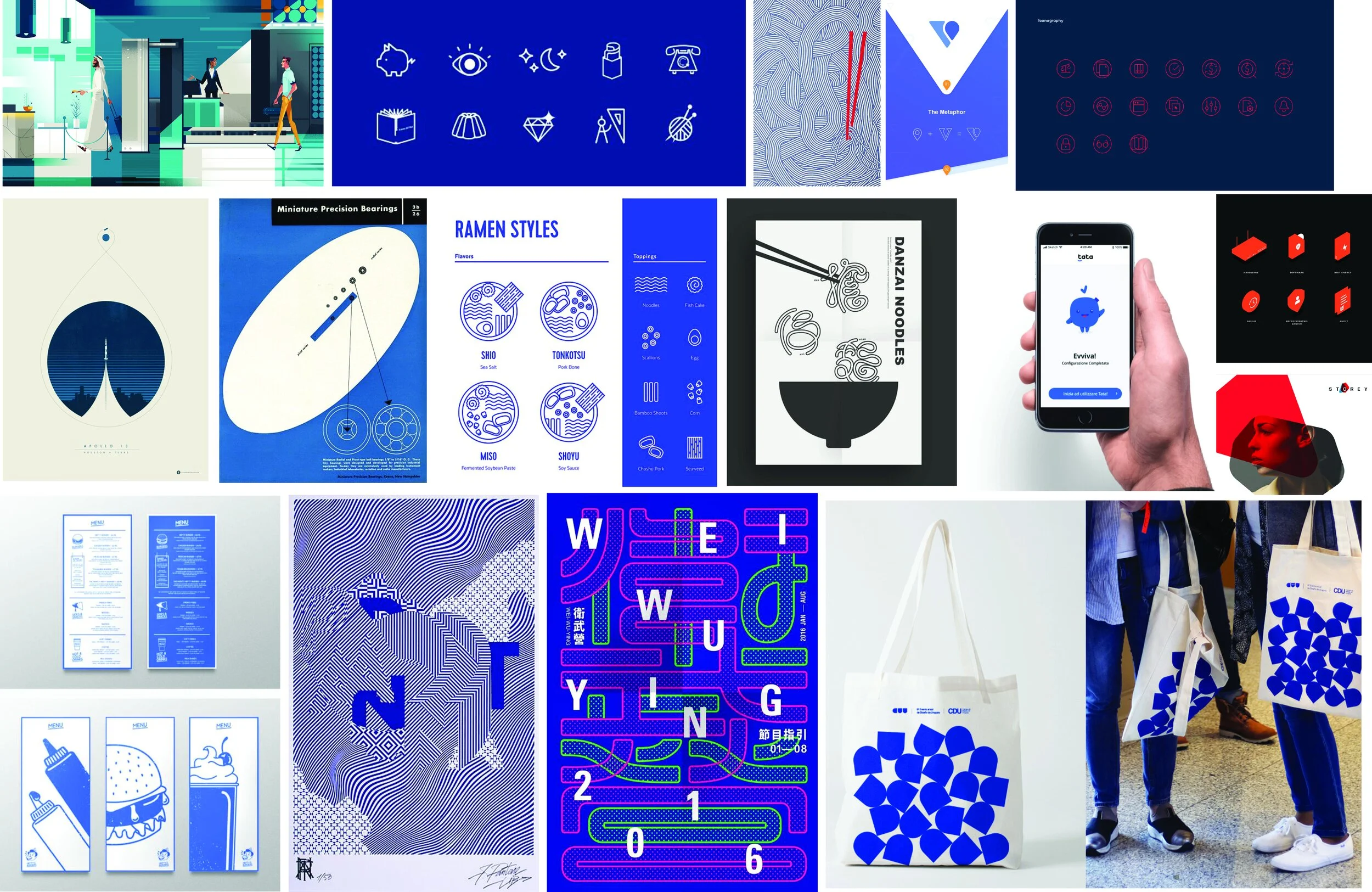
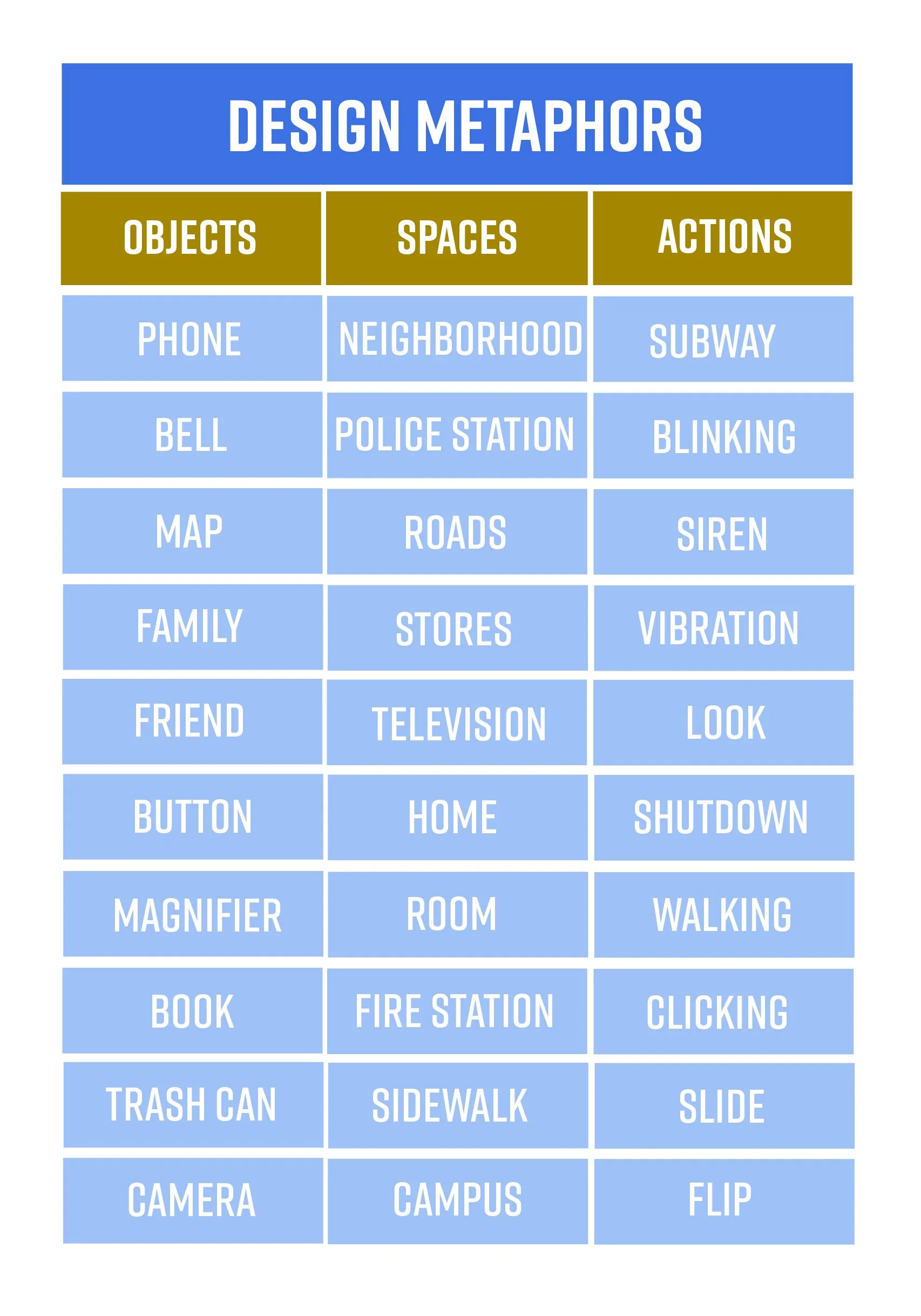
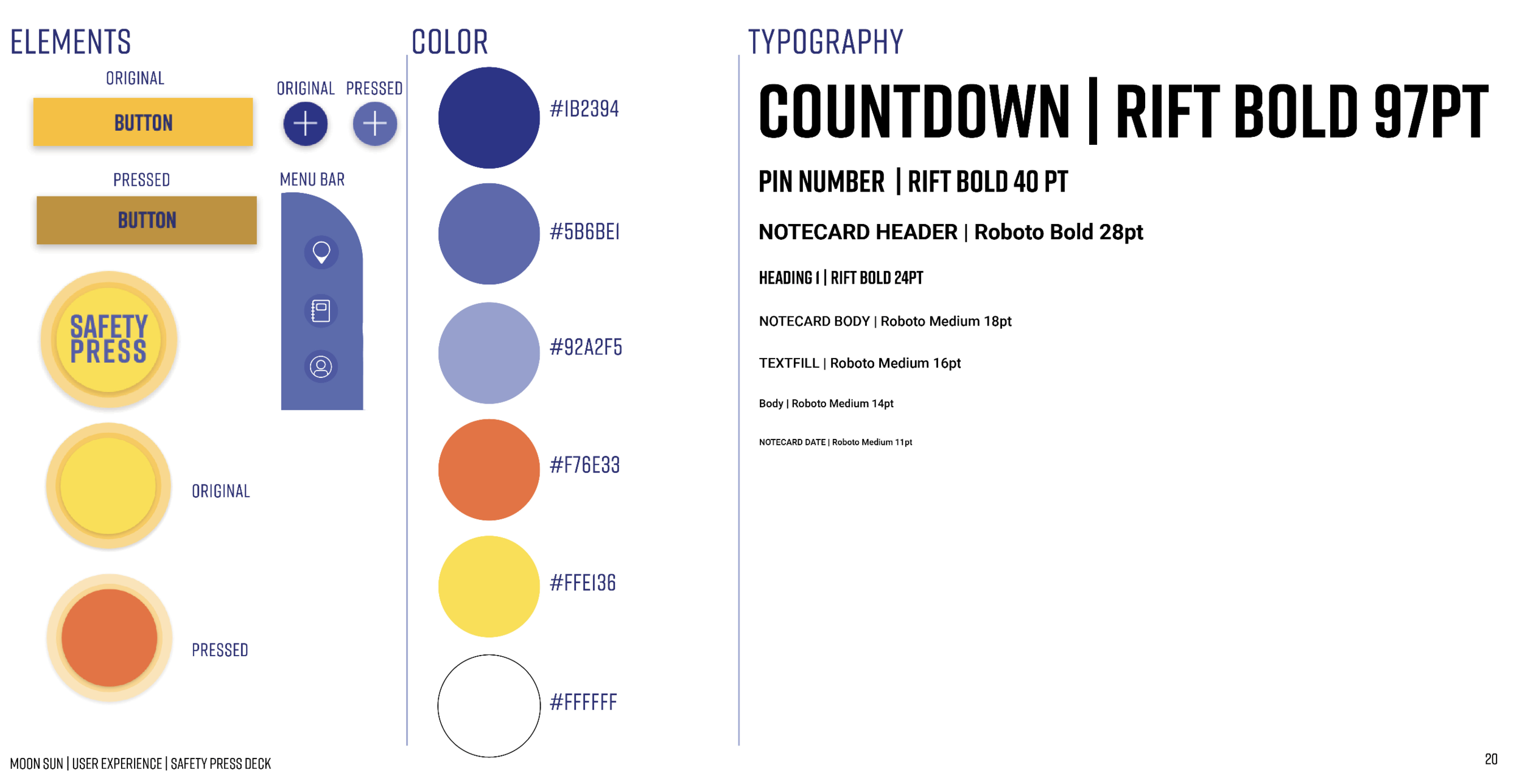
Mood Board/Visual Language/Design Metaphors
To help me create the brand and the UI design, I first made a moldboard, visual language and Design Metaphors to help me create style guide for the app.
Style Guide
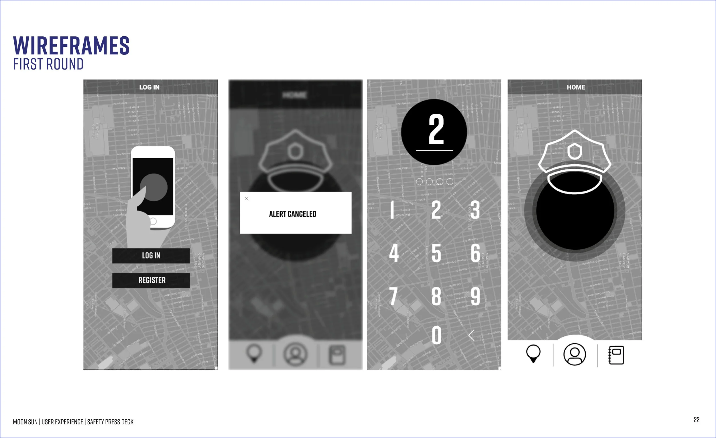
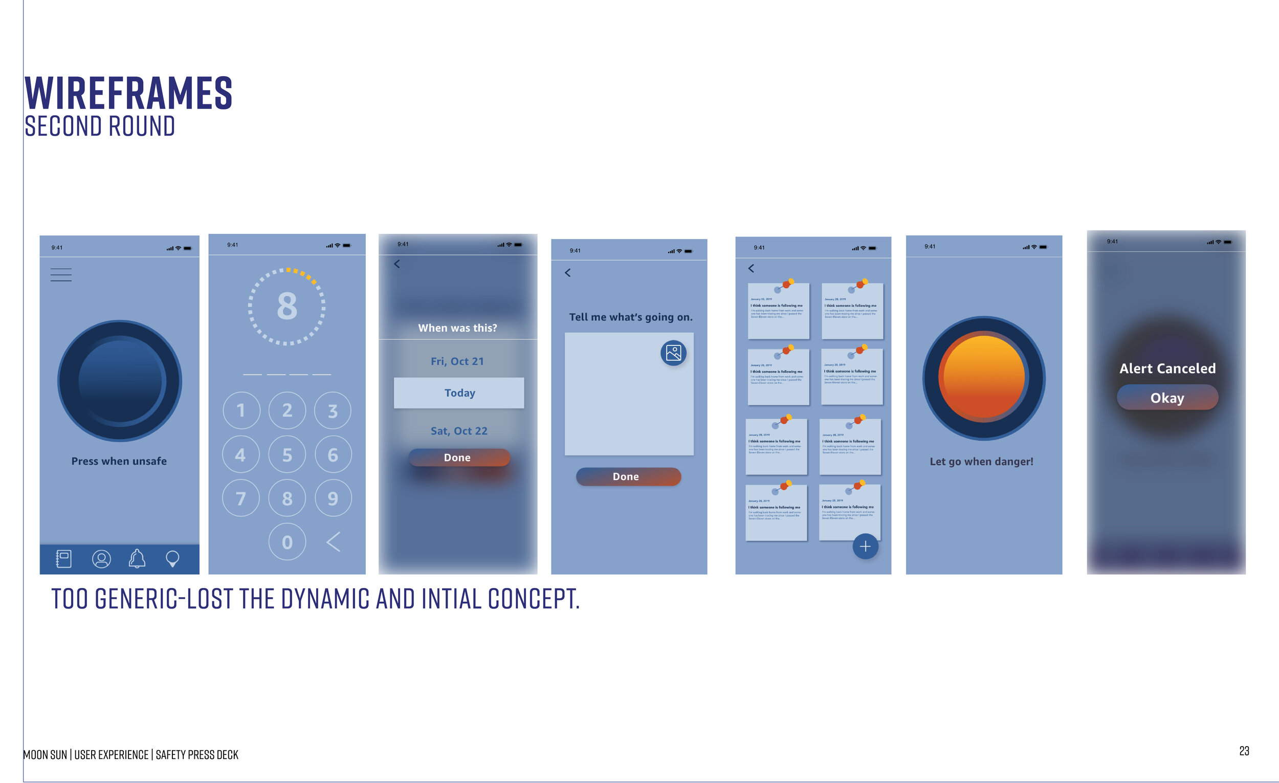
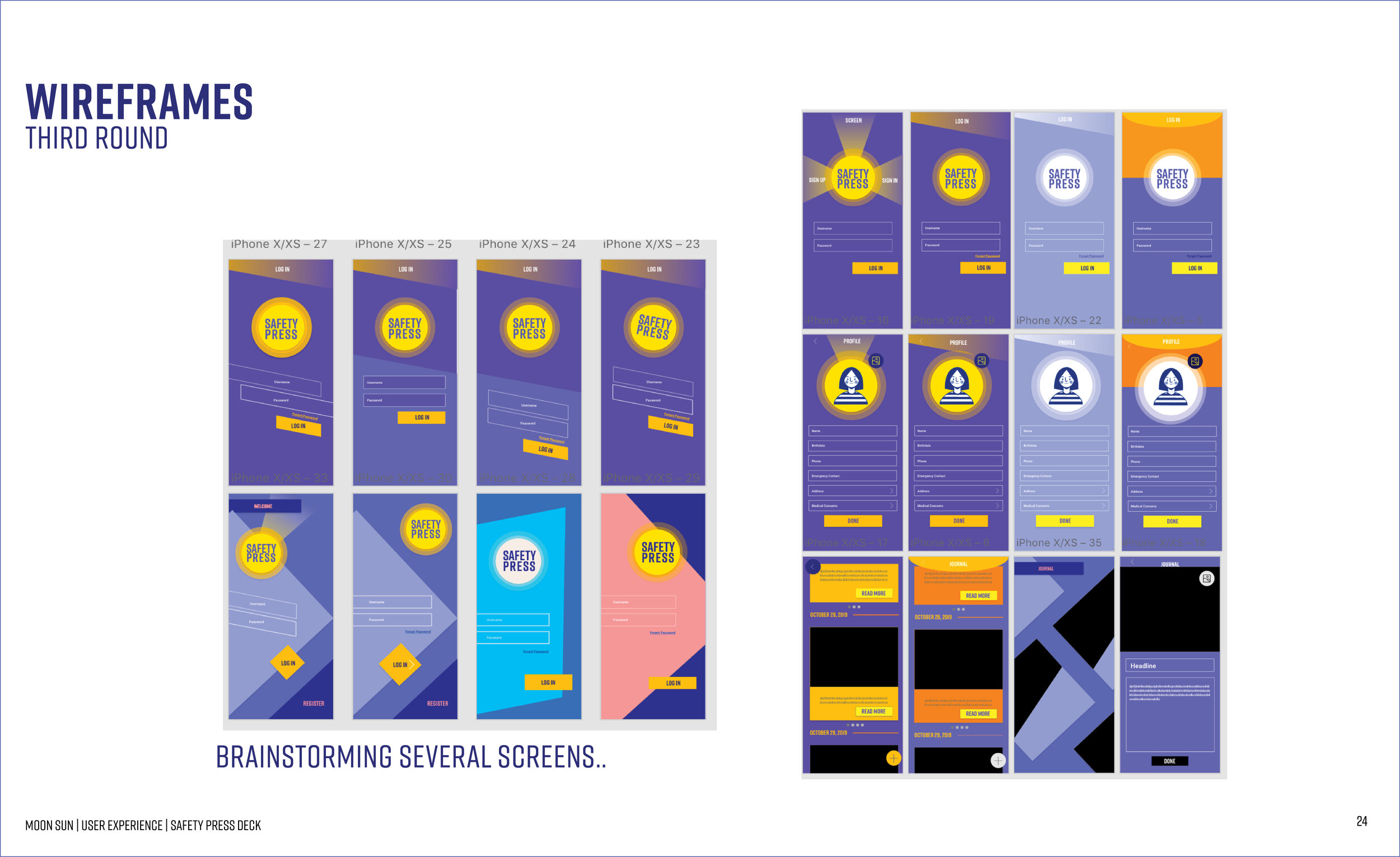
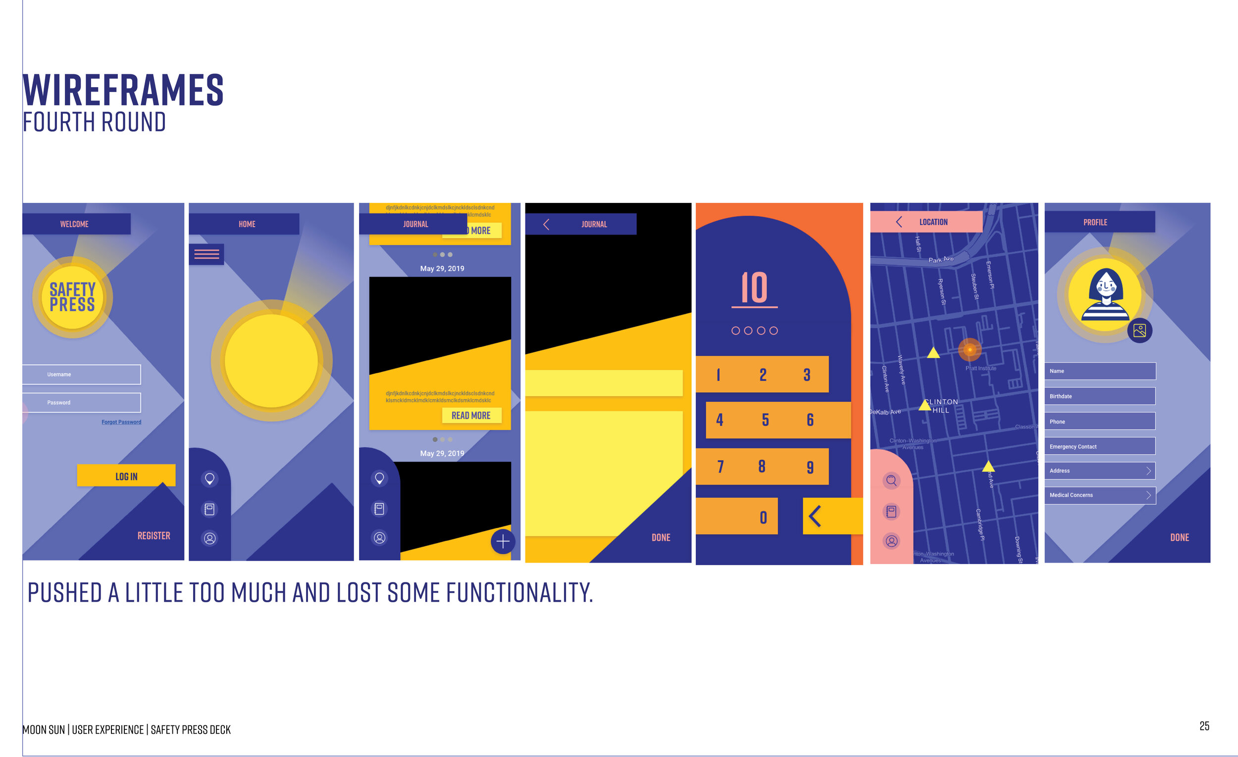
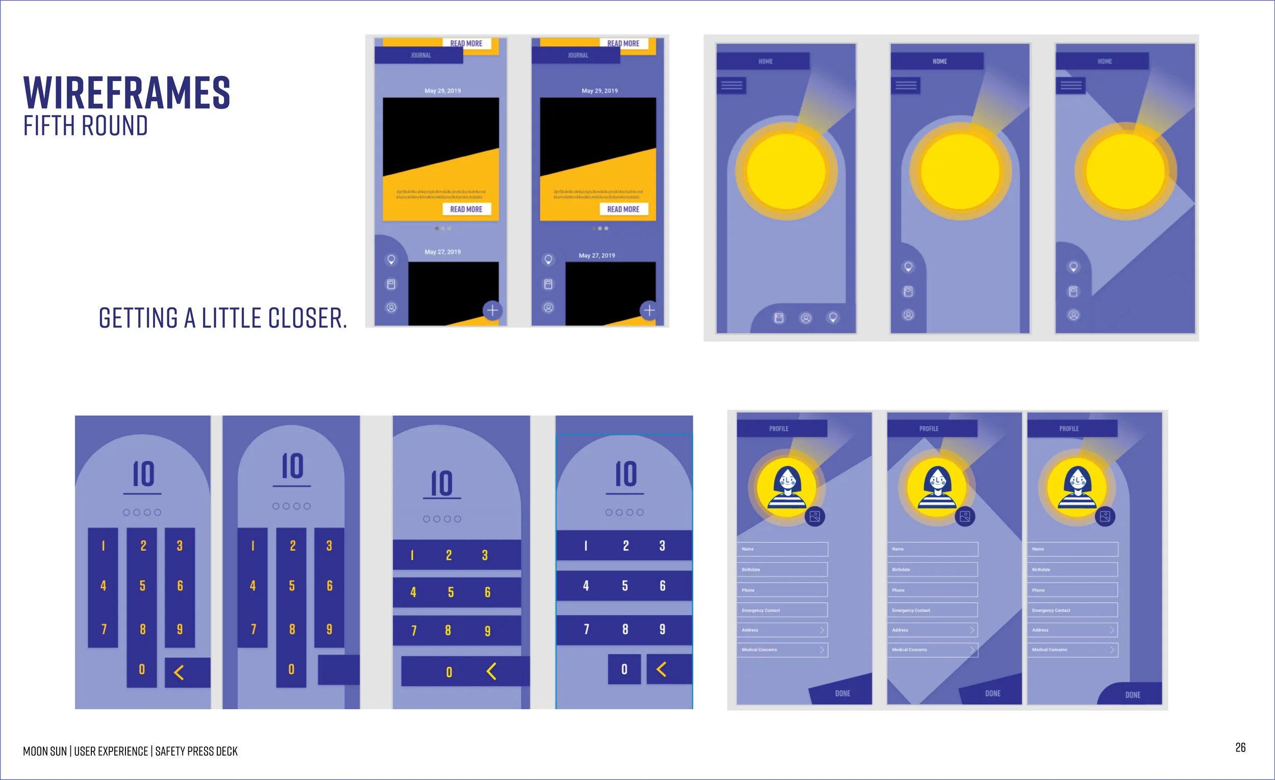
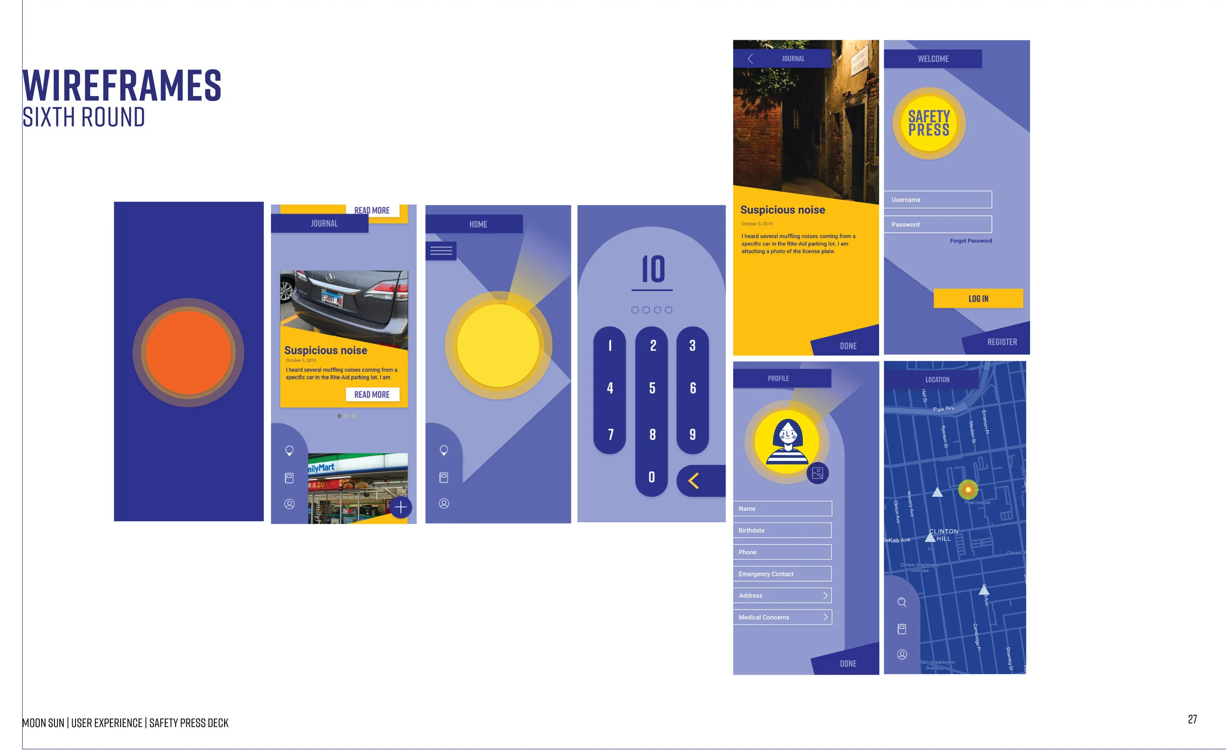
Wire Frame Rounds
I went through several rounds of making my wireframes because at first my wireframes did not reflect my visual language or moldboard. Once I hit a area that was near the visual languages I presented above, I lost a lot of functionality in my wireframes. It was hard for the user to go through the wireframes and was not very intuitive. I kept revising until I hit a area that reflected my visual language but still was very intuitive. (Please click through)
Final Interfaces